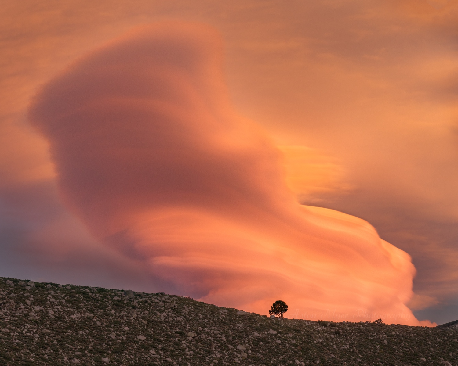
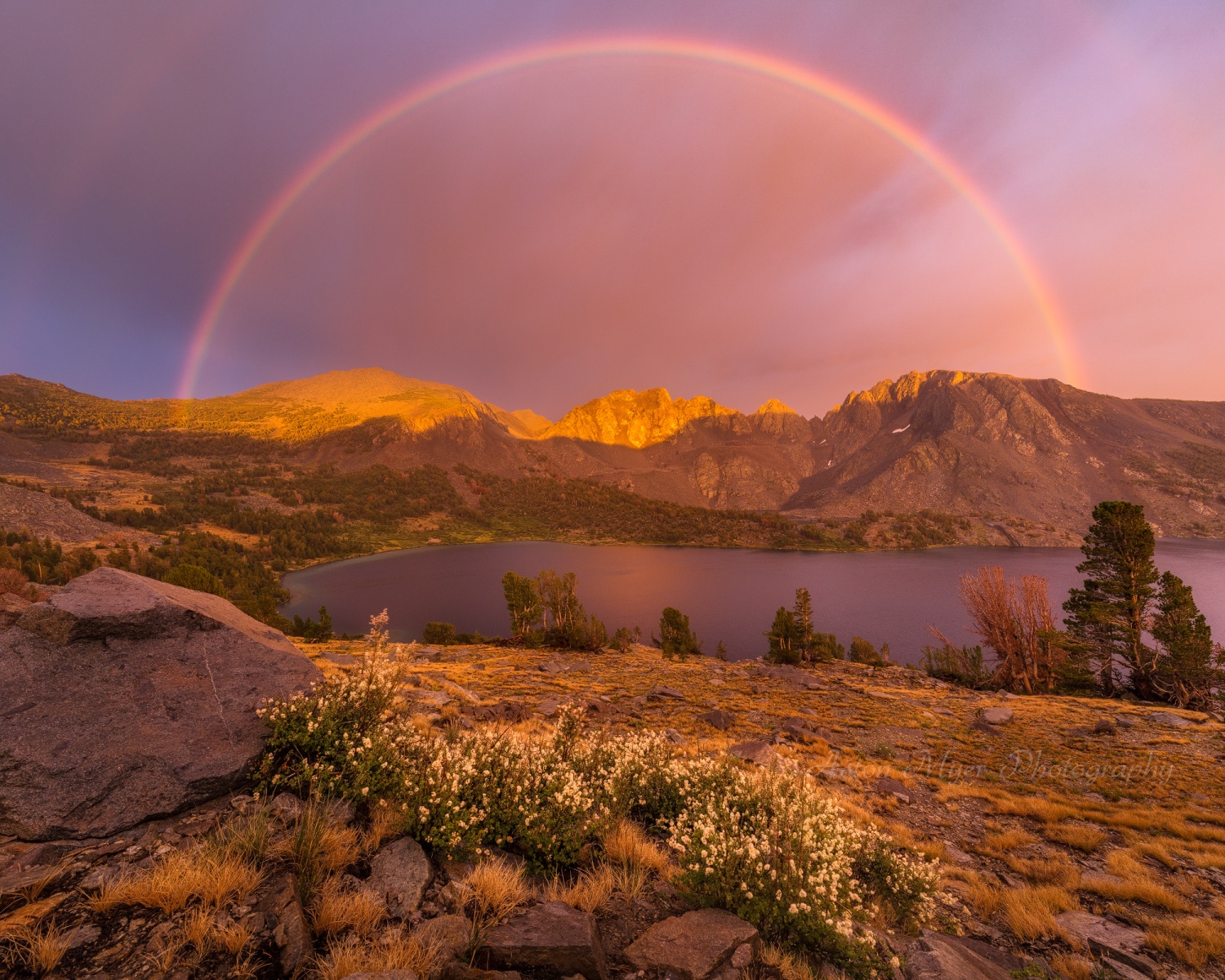
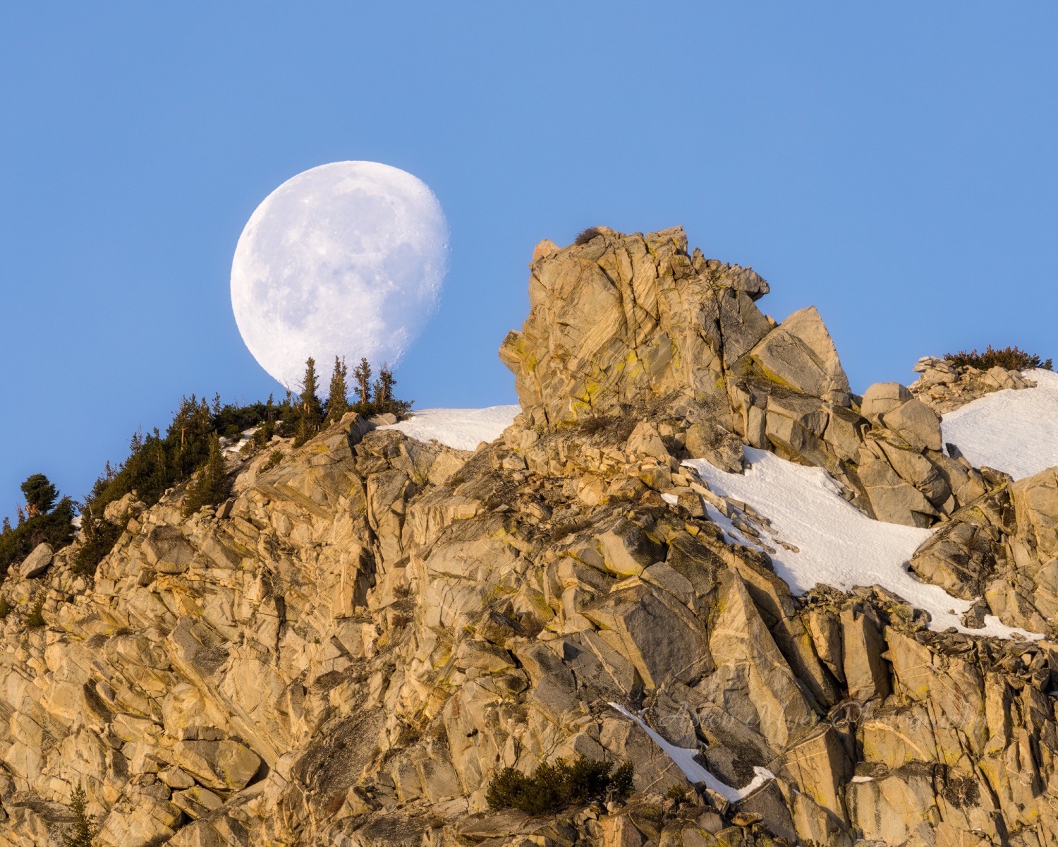
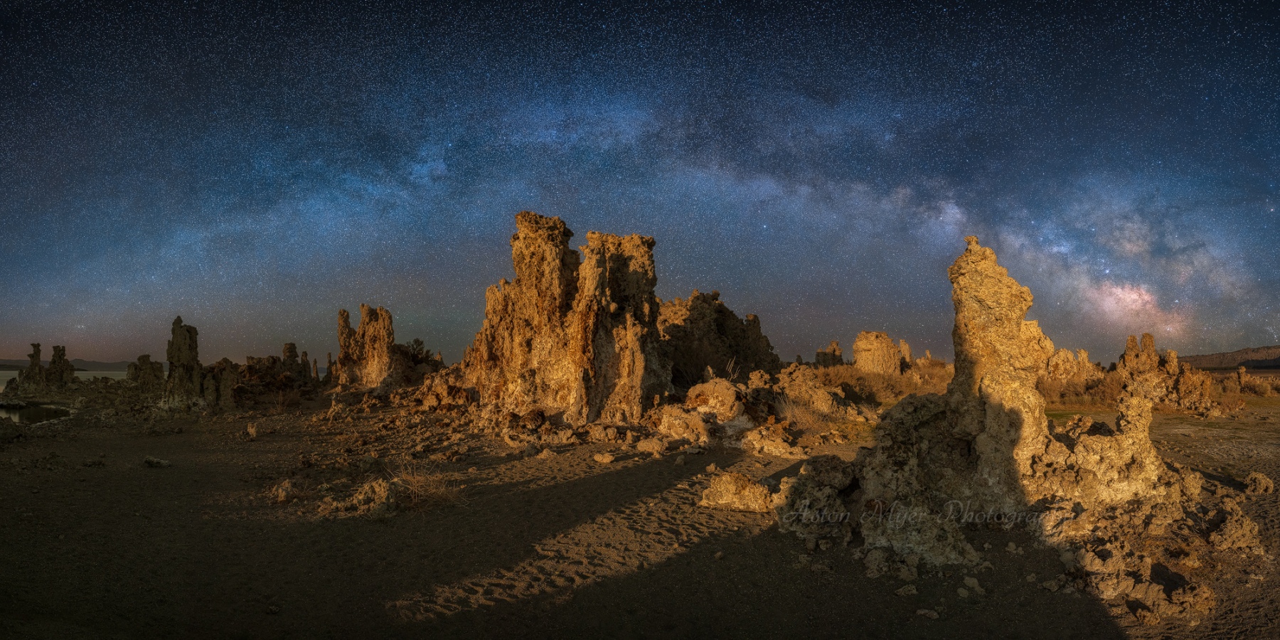
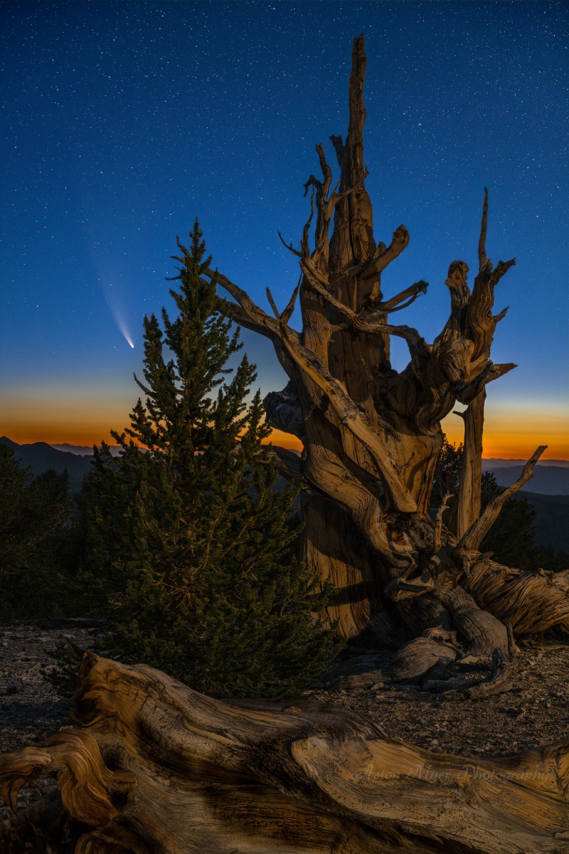
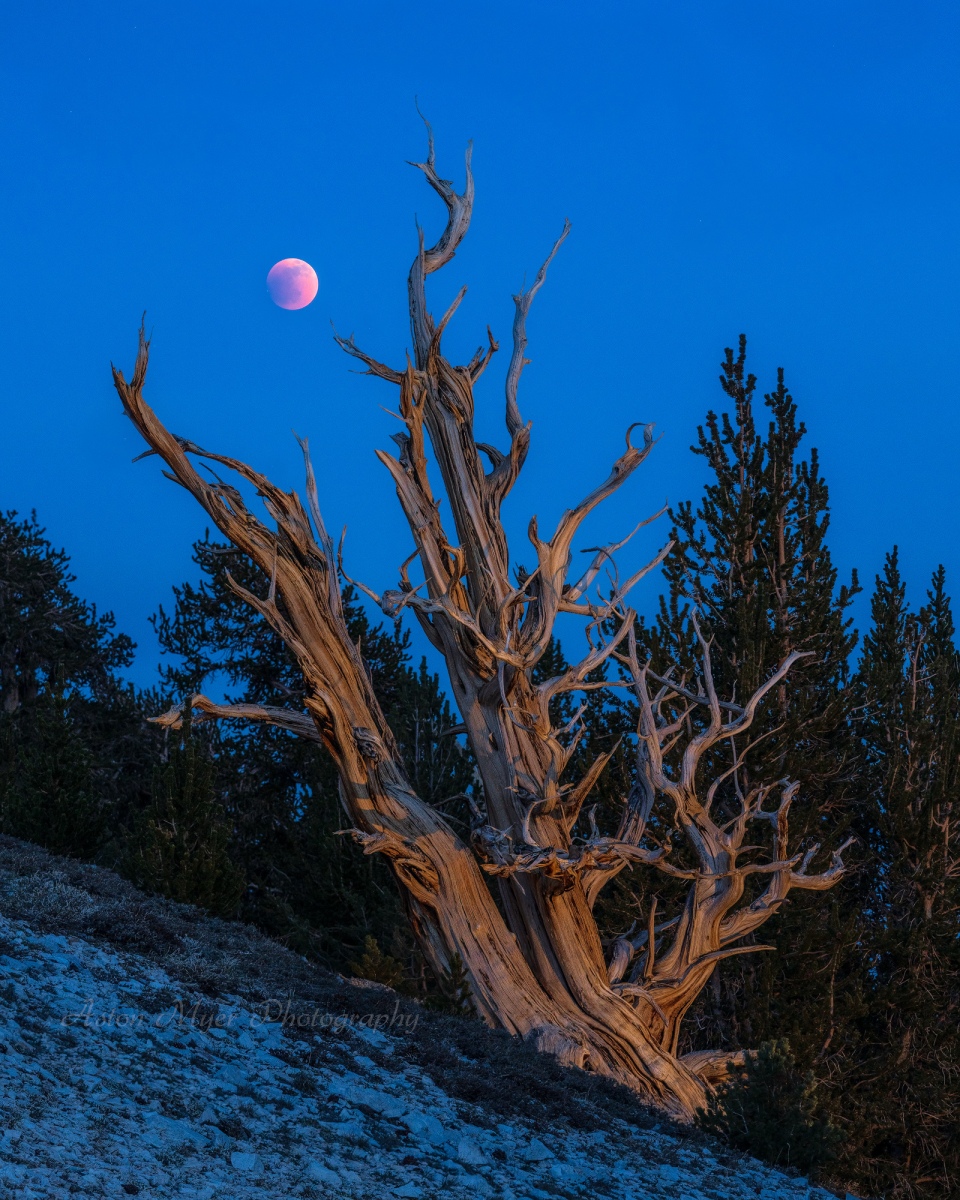
What makes a compelling photographic image? Most of the answer to that question has to do with how it is composed. Sure there’s processing and the interestingness of a subject, but clearly there is a huge range of what people find acceptable in both of those categories. I submitted images to the third annual Natural Landscape Photography Awards about a month ago; for the uninitiated, their rules disallow adding elements that weren’t present in the scene, warping of the image, and cloning out any permanent parts of the scene. In short, they disallow the average person’s definition of “Photoshopping” or heavy manipulation. There is a desire among some artists right now to lean into the original strength of landscape photography as a medium. To me the strength is the ability to capture the detail and beauty of the world we know in something close to the reality that we share. There have always been those practitioners who would warp the negative (film or digital), but those who try to hide heavy manipulation almost universally desire to grab the viewer’s attention. Lightning, aurora, vivid sunsets, rare clouds, the moon, the night sky, rainbows, and wildlife are all attention grabbing, but popular photographs shared on social media seem to want to roll all of them into one image. Editing software offered on social media promises the ability to add aurora or the Milky Way into your midday image of Yosemite to make it stand out, but does that make an image compelling?
As I was hiking back to the car from a spectacular sunrise with a Sierra Wave cloud, I turned on some music to avoid listening to my squeaking backpack when Stinkfist by Tool came on. It perfectly translates the feeling I have on the subject:
Something kind of sad about
The way that things have come to be,
Desensitized to everything,
What became of subtlety?
How can this mean anything to me
If I really don’t feel anything at all?
I’ll keep digging ‘til
I feel something
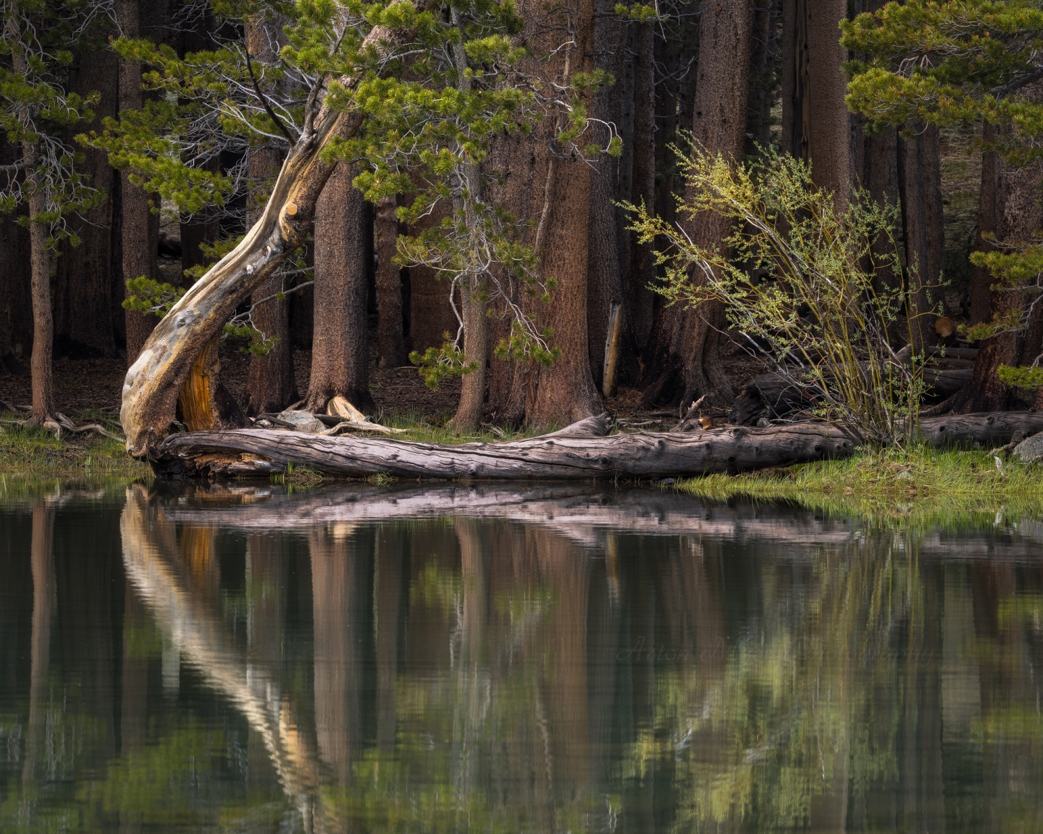
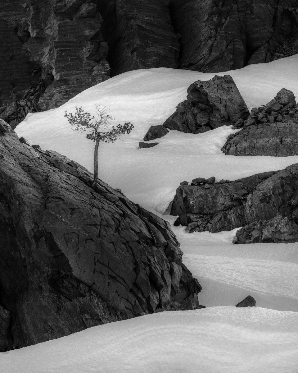
A lightning strike in the middle of a rainbow while a unicorn flies over the aurora sounds super amazing, but it doesn’t make a compelling image just because of those elements. Much of the time it’s just like candy. Candy tastes good at first, but a steady diet of junk food leaves one unfulfilled and chasing the next hit of sugar. The scroll through social media rewards images that catch a person’s eye immediately with something shiny, and I’ve seen how this affects people’s consumption of visual imagery when I’m in my art festival booth. I see people flip through prints I’ve made like they’re trying to start a fire. Rather than cater to the overstimulating conditioning we’ve been subjected to, I’ll continue to photograph what’s interesting to me, including the small, subtle scenes. Don’t misunderstand me, though. I love photographing rainbows, lightning, the moon, and so on, but the exclusive pursuit of them would diminish the value of the simple beauty all around me.
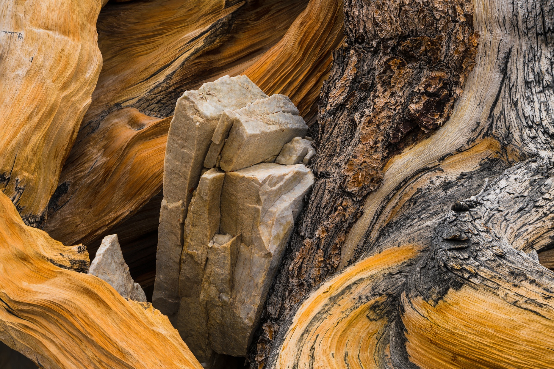
The most common mistake beginner photographers seem to make in the pursuit of a compelling photograph is wanting to capture everything. With my students, I usually start with the question, “What caught your eye?” If you’re trying to tell a story, including everything would make a boring narrative: “I woke up to the sound of my alarm and opened my eyes. I could see the faint blue light of the alarm, and as I rolled over I could see my cat’s litter box. I successfully turned off the alarm on my second try. I took a sip of water and threw off the blanket…” Most people would tune out if I described everything on the way to me almost being struck by lightning in a sudden hailstorm. But as someone who is frequently reminded to elaborate in regular conversation, “I almost got struck by lightning today” needs at least a little bit of context. Our brains only have so much place to put attention. Including the entire environment in a photograph is the equivalent of giving too much extraneous detail, and the story will be lost. On the other end, going in tight on an interesting stick without any context can feel like it’s missing something.
My philosophy on composition is simple and the standard guidelines (like the rule of thirds) tend to just annoy me. Is the light nice? Does the image have a subject to catch the eye? Does the eye move throughout the image in a pleasing way? Do the elements of the image feel unified? Those are my main questions (there are more), and if the answers are yes, you can bet I don’t care about the rule of thirds. I make a lot of images and failure is baked in. Conditions don’t always work out, but there are always stories to tell even if they’re understated. A compelling landscape image essentially has no rules, and varies from person to person, but art is about the pursuit of emotional truth. My truth is that nature is enough by itself. A tree can be compelling on its own. A rising moon is welcome to join the party, but wanting nature to do all the things at once makes my truth slip away.
